The Worst And Best Paint Jobs
Some NASCAR paint schemes are pure perfection, while others look like a five-year-old went wild with a crayon set. From bizarre color clashes to downright confusing designs, some cars were impossible to ignore—for all the wrong reasons. Get ready to relive the ten ugliest and the 10 best paint jobs to ever hit the track!
1. 1998 No. 9 Cartoon Network Ford Taurus (Lake Speed)
Few cars in NASCAR history have been as visually chaotic as this one. Plastered with Cartoon Network characters from multiple shows, the design felt like an overzealous kid’s lunchbox exploded onto the track. The mix of bright hues and cartoon figures made sponsor visibility an afterthought.
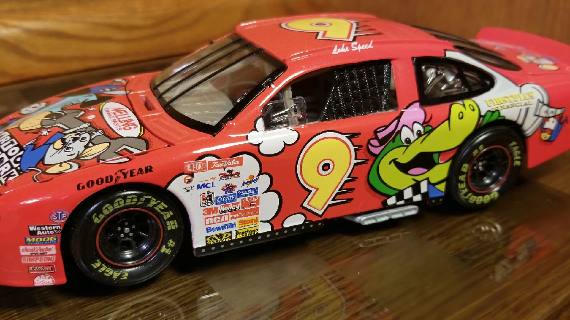 NASCAR Diecast Review: Lake Speed Cartoon Network by Raceccraze 95
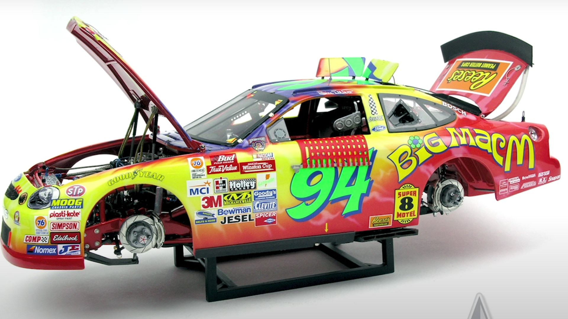
2. 1998 No. 94 "Get Back with Big Mac" Ford Taurus (Bill Elliott)
Tie-dye meets fast food? McDonald's took a wild turn with this psychedelic mess. A swirl of reds, yellows, and greens covered Elliott’s car, turning it into a visual overload. The attempt at a nostalgic ’60s vibe backfired, which made this one of the strangest schemes in NASCAR history.
3. 2008 No. 24 Nicorette Chevrolet — Jeff Gordon
Jeff Gordon’s 2008 No. 24 Nicorette Chevrolet looked less like a fierce NASCAR contender and more like a pack of gum lost in the pit lane. Fans weren’t thrilled, and even on track, it seemed allergic to victory, failing to find victory lane all season. Compared to Gordon’s classic flames, this scheme felt like a bad marketing experiment gone wrong.
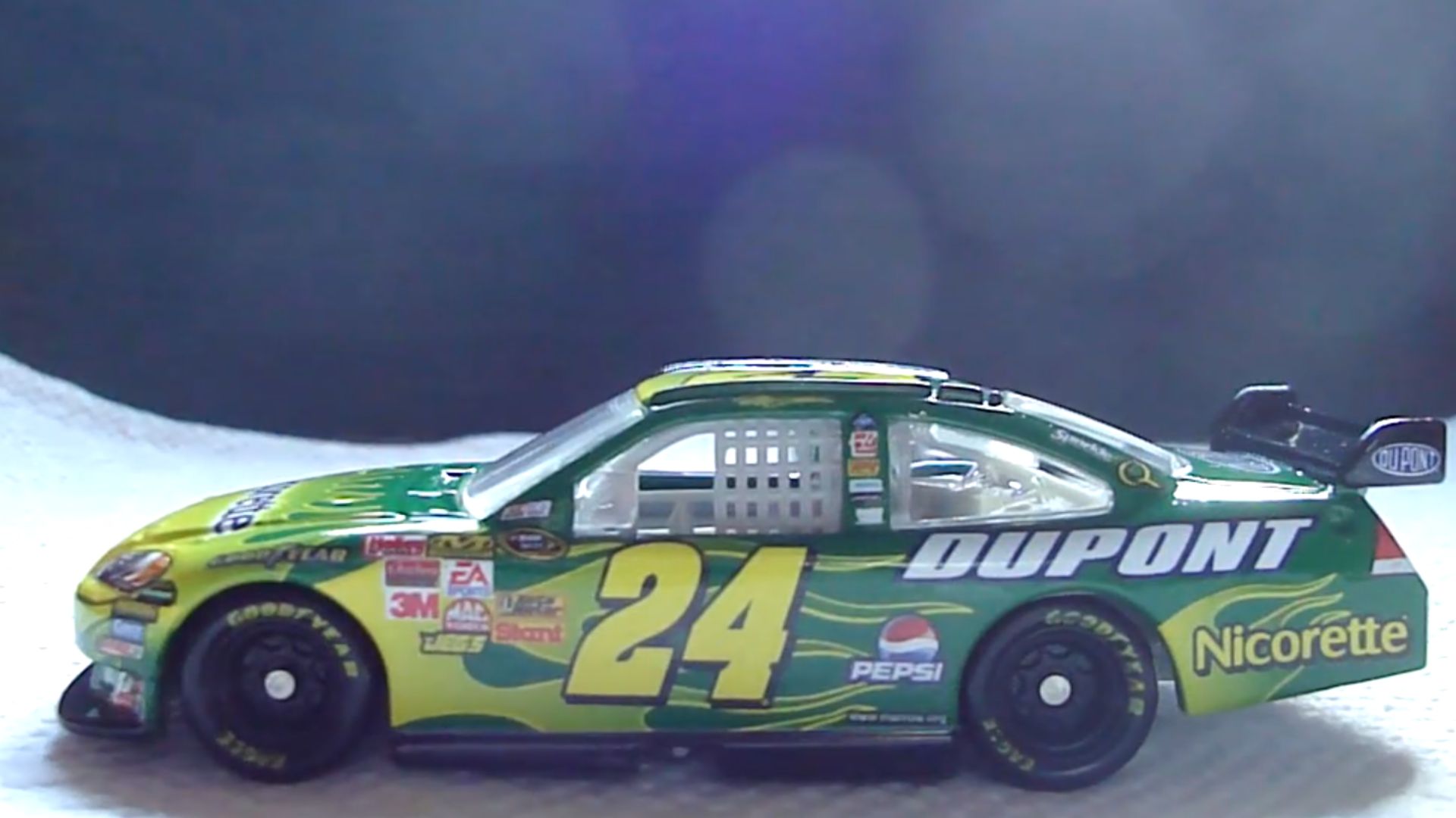 Jeff Gordon Nicorette Chevy 2008 Diecast Review by Soupjr48
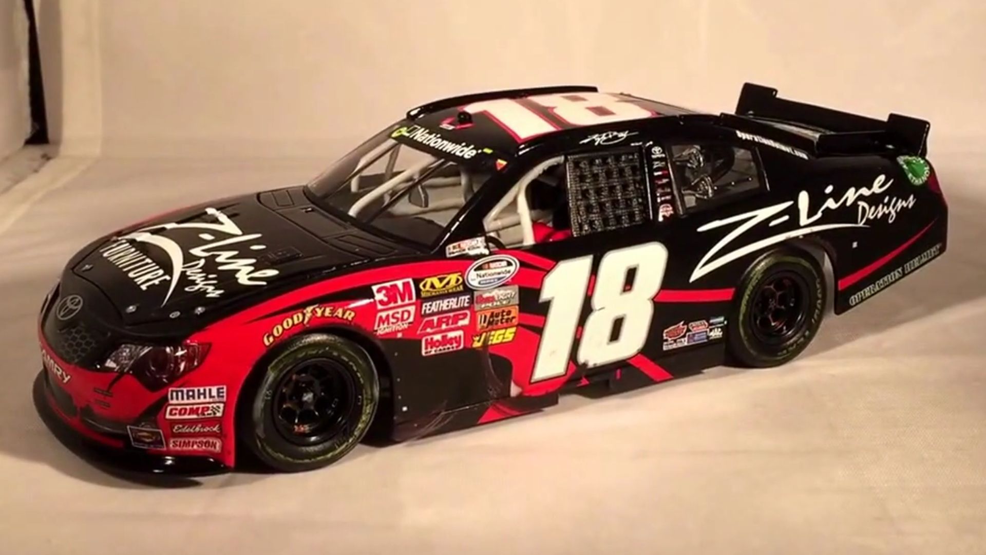
4. 2010 No. 18 "Z-Line Designs" Toyota Camry (Kyle Busch)
Loud and unbalanced, this scheme misfired on every level. Hot pink accents clashed aggressively with the main body, which made the car look more suited for a fashion runway than a racetrack. Despite its attempt to be edgy, it became infamous as one of Busch’s least appealing rides.
5. 1999 No. 94 "Toy Story 2" Ford Taurus (Bill Elliott)
Movie tie-ins can be hit or miss, and this one was an absolute miss. The design was less about showcasing the car and more about cramming as many animated characters as possible onto it. Rather than celebrating Pixar’s success, it looked more like a moving billboard in a bad way.
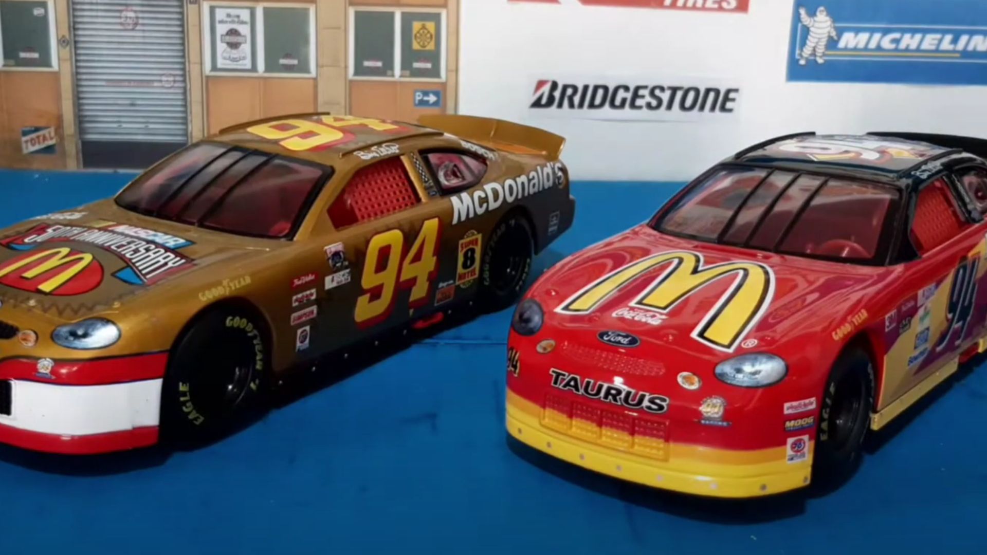 Ford Taurus de Nascar #94 escala 1:24. #LaColeccióndeRica #Ford #Taurus #Nascar by ricardo montero
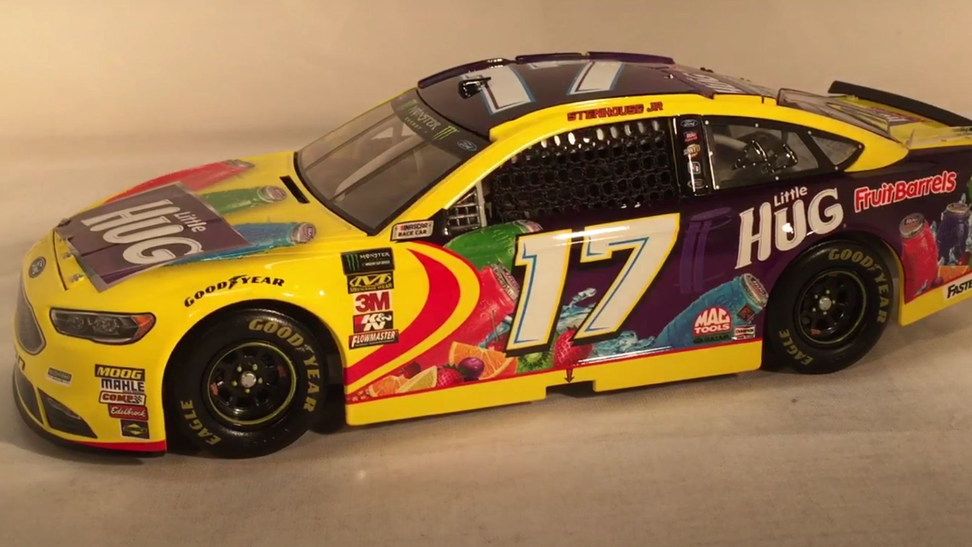
6. 2018 No. 17 "Little Hug Fruit Barrels" Ford Fusion (Ricky Stenhouse Jr.)
Fruit-flavored drinks belong in lunchboxes, not NASCAR. This rainbow explosion of purples, yellows, and blues looked more like a candy wrapper than a competitive race car. The bright, bubbly theme clashed with the aggressive nature of NASCAR racing, which made it one of the most questionable sponsorship designs in years.
7. 1998 No. 9 "Scooby-Doo" Ford Taurus (Lake Speed)
Some themes just don’t belong on high-speed race cars, and Scooby-Doo learned that the hard way. The Mystery Machine-inspired color scheme was drowned in excessive logos. The spooky design didn’t scare off the competition—it just confused the audience.
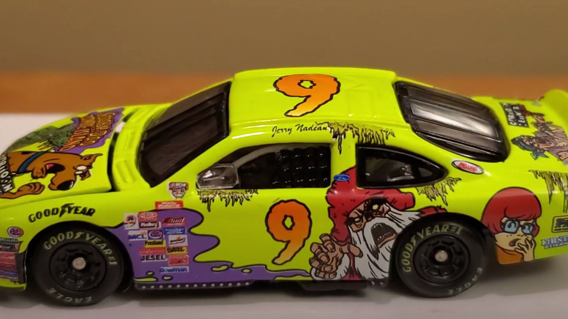 1998 Jerry Nadeau Scooby-Doo Zombie Island 1:64 (NASCAR Die-Cast Review) by OriginalBigBry
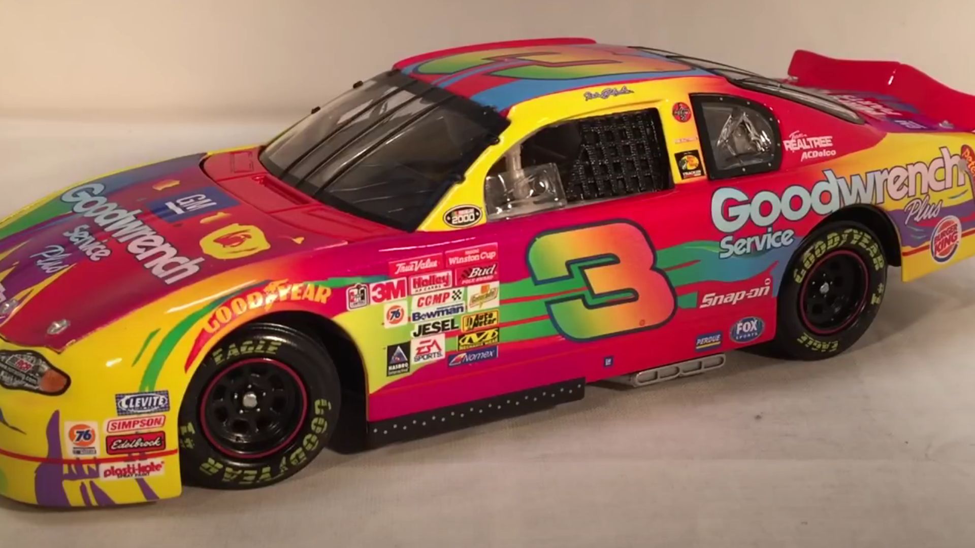
8. 2000 No. 3 "Peter Maxx" Chevrolet Monte Carlo (Dale Earnhardt)
Dale Earnhardt’s intimidating black car was traded in for a swirl of neon insanity. Designed by pop artist Peter Maxx, this scheme clashed with everything Earnhardt represented. The abstract colors and chaotic shapes overwhelmed the car’s natural lines, making it an oddball entry in his otherwise iconic career.
9. 2012 No. 10 "Danica Double" Chevrolet (Danica Patrick)
Green and orange are tricky to balance, and this scheme proved it. GoDaddy’s usual neon green was already divisive, but adding bright orange only made it worse. The resulting clash of colors left the car looking more like a highlighter collection than a serious NASCAR contender.
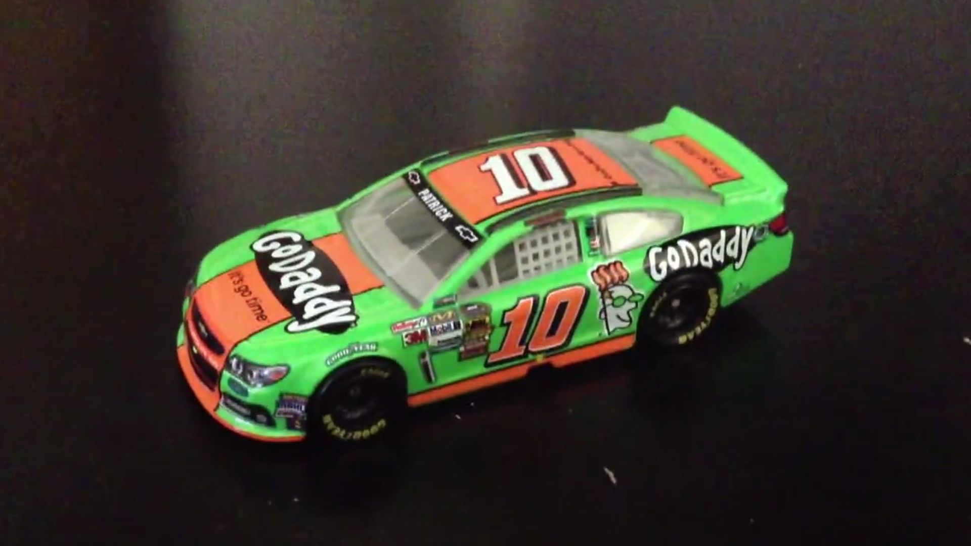 NASCAR- Danica Patrick- Diecast Review by ArsenalBarclays
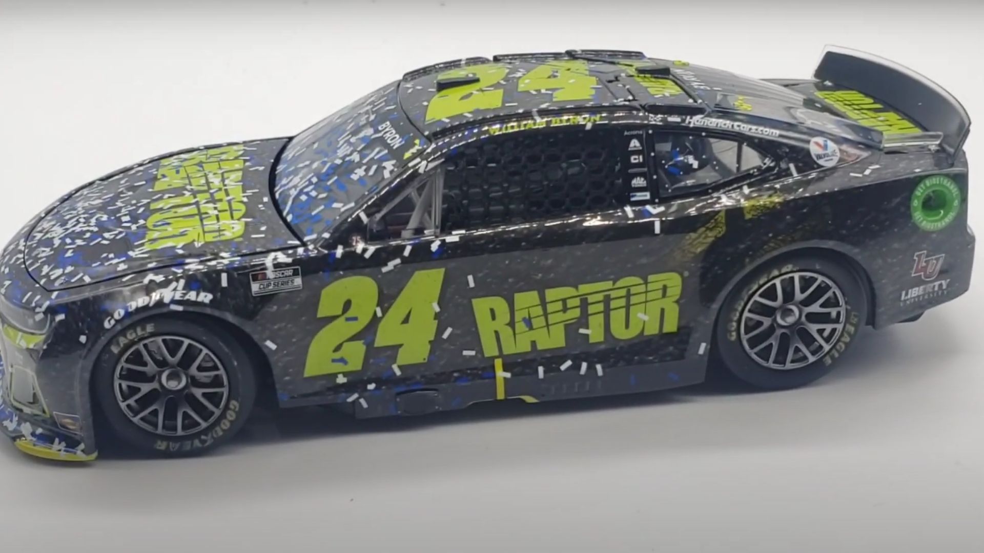
10. 2022 No. 24 "Raptor" Chevrolet Camaro (William Byron)
Simplicity can be powerful, but this was simply dull. Byron’s all-gray scheme lacked vibrancy and contrast, making it hard to distinguish details even on high-definition broadcasts. Fans expect NASCAR liveries to be exciting, and this one barely looked like it had been designed at all.
Now, let’s shift gears and celebrate the ten best NASCAR paint schemes.
1. 1995 No. 24 "Rainbow Warriors" Chevrolet (Jeff Gordon)
Vibrant, iconic, and instantly recognizable. Jeff Gordon’s rainbow-colored scheme became one of NASCAR’s most beloved designs. The combination of bright colors and clean sponsor placement made it stand out on the track, turning Gordon into a household name and his car into a legend.
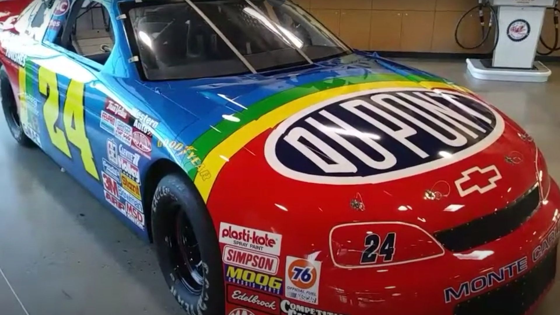 Jeff Gordon's 1995 DuPont Chevy(First Ever Full scale die cast review) by Beverage Hunters
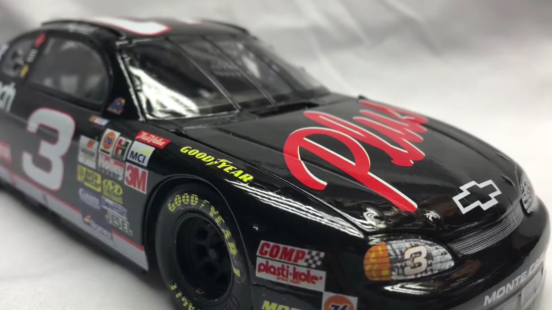
2. 1998 No. 3 "Goodwrench" Chevrolet (Dale Earnhardt)
Few cars commanded respect like the black No. 3. Earnhardt’s jet-black Goodwrench Chevrolet became the definition of intimidation. It wasn’t flashy, but its simplicity reinforced Earnhardt’s persona as "The Intimidator." The contrast between darkness and power made this scheme a timeless classic.
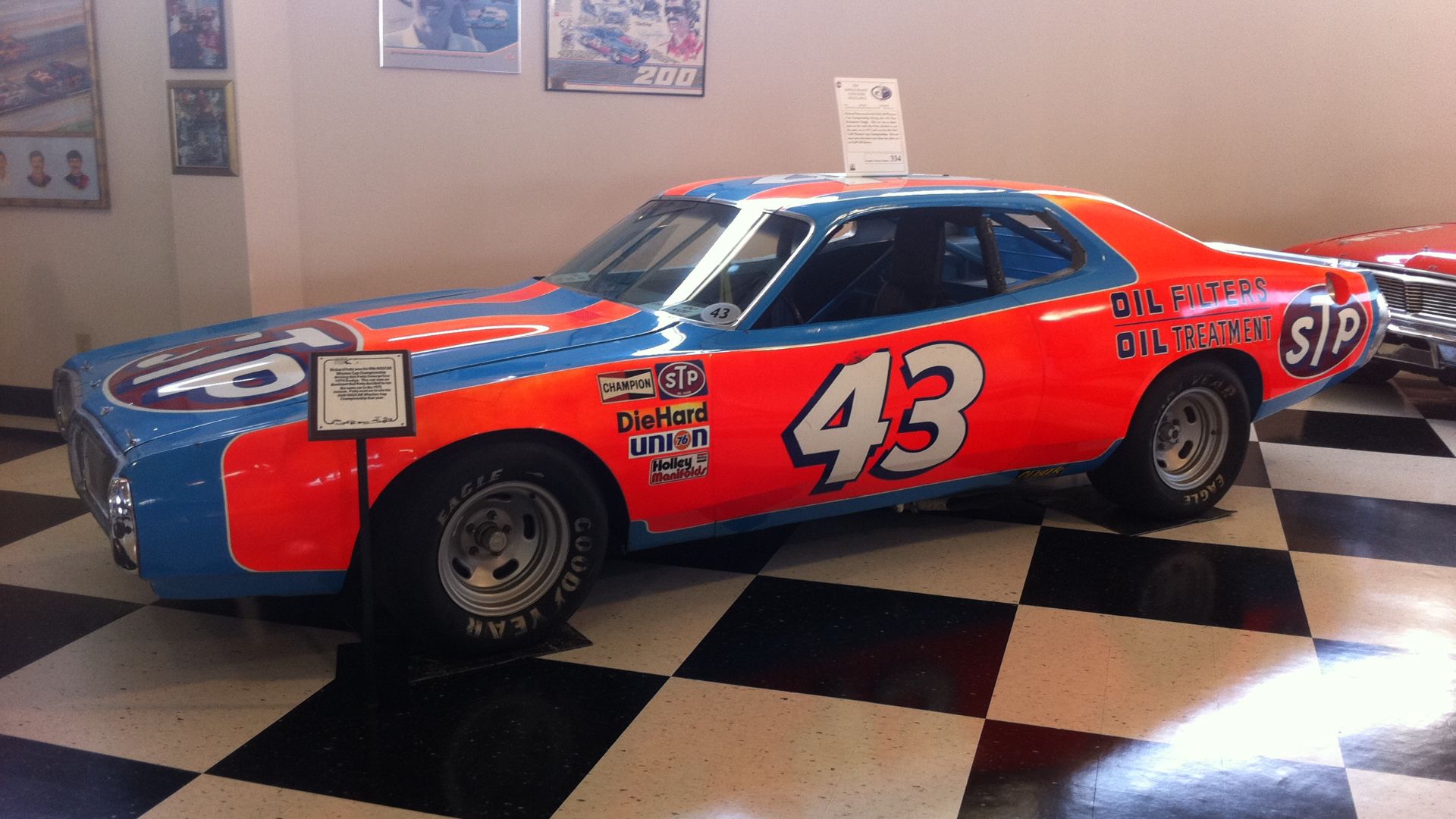
3. 1976 No. 43 "STP" Dodge Charger (Richard Petty)
Blue and red never looked better. Richard Petty’s legendary No. 43 STP car blended speed and style perfectly. Its signature Petty Blue with bold red accents became a symbol of dominance, ensuring it remains one of the most recognizable liveries in NASCAR history.
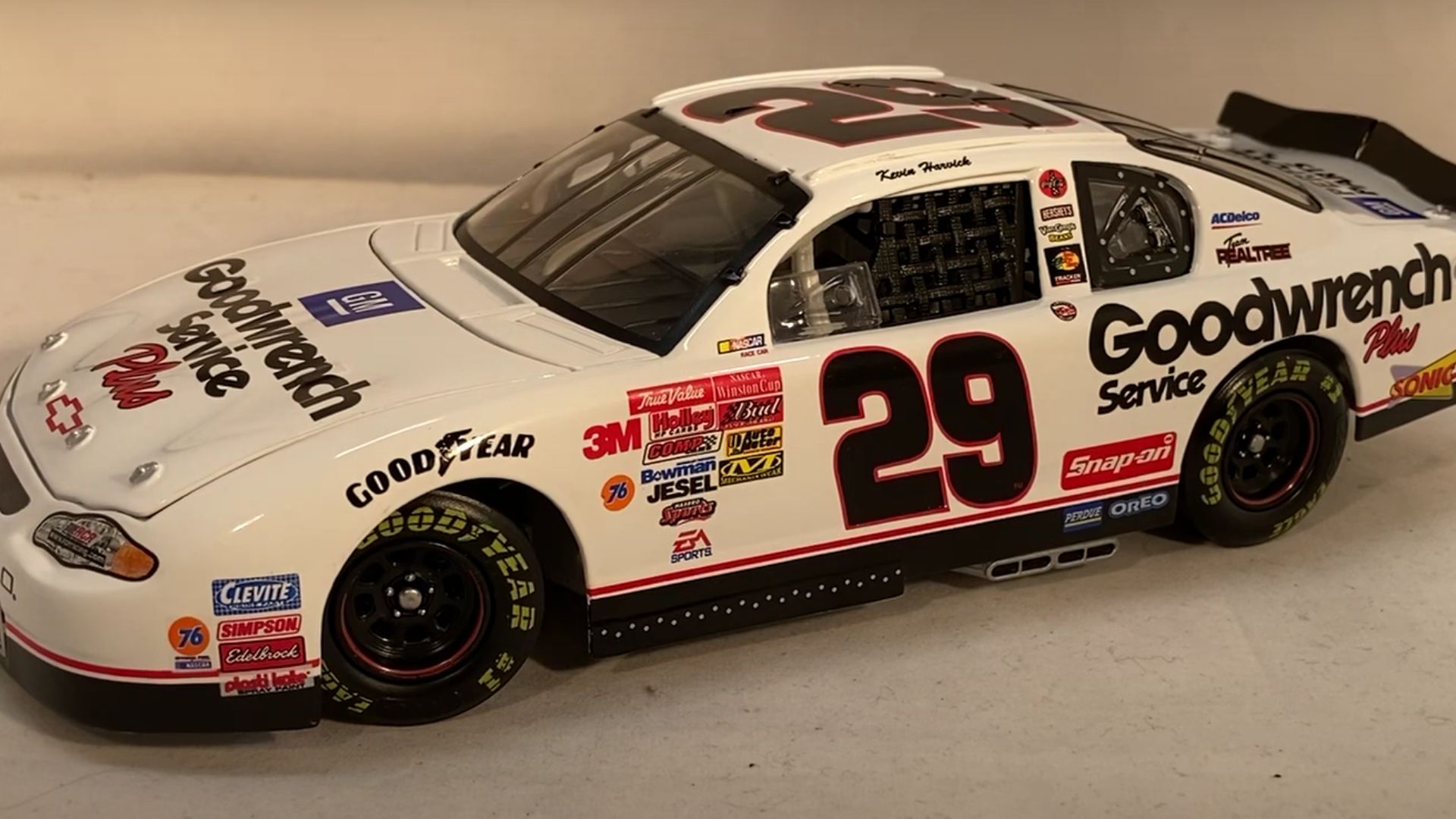
4. 2001 No. 29 "GM Goodwrench" Chevrolet (Kevin Harvick)
An emotional tribute that turned into an instant classic. Harvick’s white No. 29 carried the weight of replacing Dale Earnhardt. His Atlanta victory cemented this scheme as a symbol of resilience, which proved that legacy designs can carry as much weight as the ones that came before them.
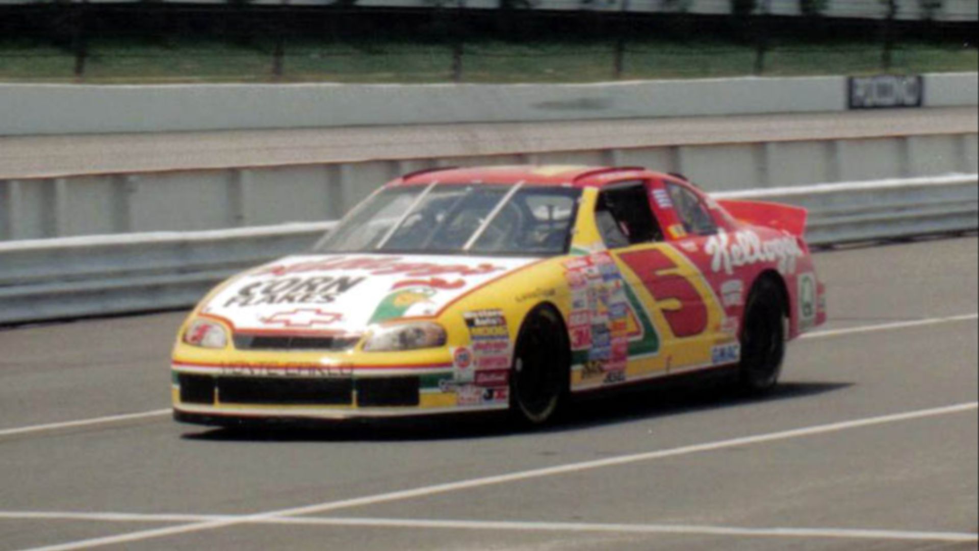
5. 1996 No. 5 "Kellogg's" Chevrolet (Terry Labonte)
Bright and fun without being excessive. Kellogg’s partnership with Labonte produced one of NASCAR’s best-looking schemes. The crisp yellow, red, and blue colors balanced branding with visual appeal, making this a favorite among fans and collectors alike.
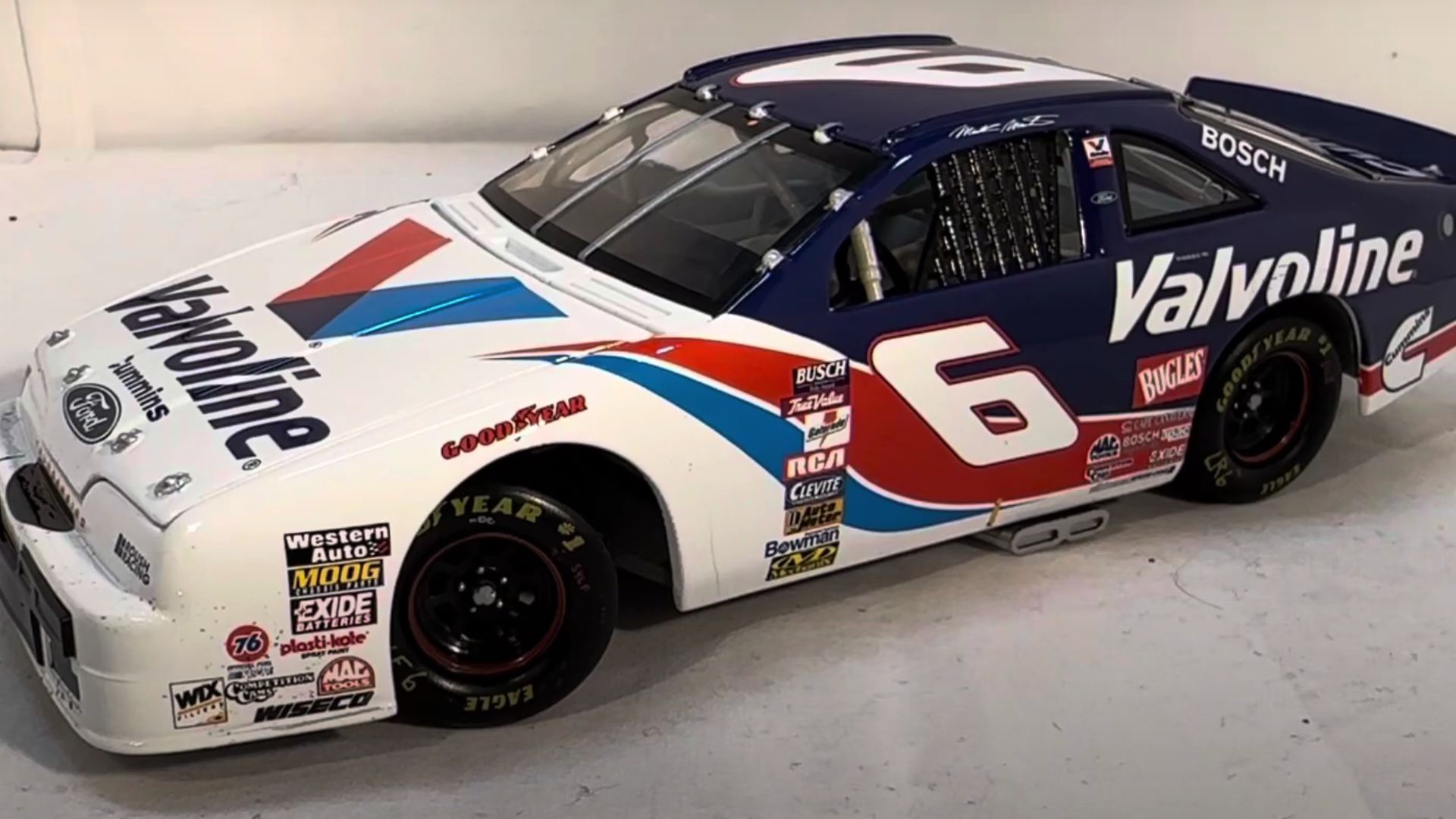
6. 1998 No. 6 "Valvoline" Ford (Mark Martin)
Mark Martin’s Valvoline scheme used patriotic red, white, and blue to perfection. Clean lines and a bold presence ensured it was instantly identifiable. It remains one of the best representations of a well-balanced and visually pleasing NASCAR livery.
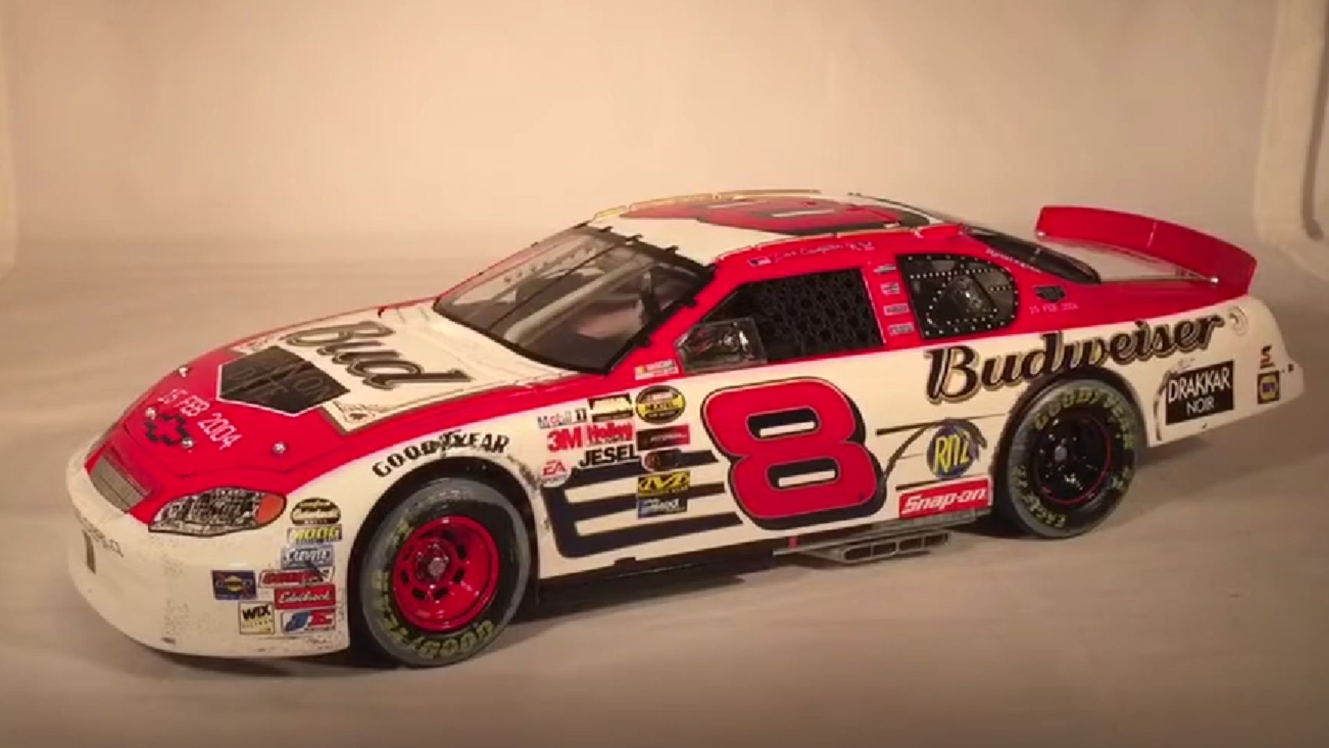
7. 2004 No. 8 "Budweiser" Chevrolet (Dale Earnhardt Jr.)
Few sponsors have had as much synergy with a driver as Budweiser and Dale Jr. The clean red paint, sharp white accents, and unmistakable No. 8 made this scheme iconic. Even after switching sponsors, fans still associate Earnhardt Jr. with this timeless look.
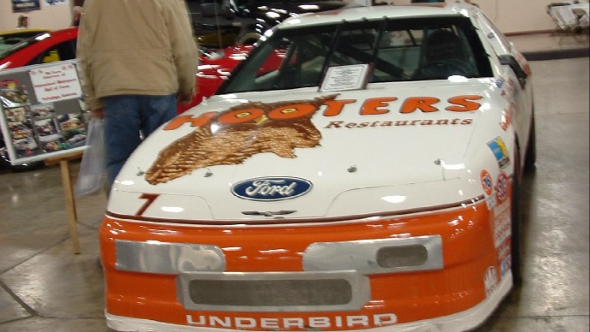
8. 1992 No. 7 Ford (Alan Kulwicki)
Championship moments deserve great designs. Kulwicki’s No. 7 car blended sponsor visibility with aesthetic appeal. Its bold orange, white, and black scheme stood out on the track and in diecast form, making it one of the best-looking liveries of its era.
9. 2001 No. 24 "Pepsi" Chevrolet (Jeff Gordon)
Limited-time designs can be spectacular. Gordon’s Pepsi scheme broke from his usual colors and introduced a bold blue-and-silver combination. Fans loved it, and the car remains one of the best examples of how special edition schemes can become legendary.
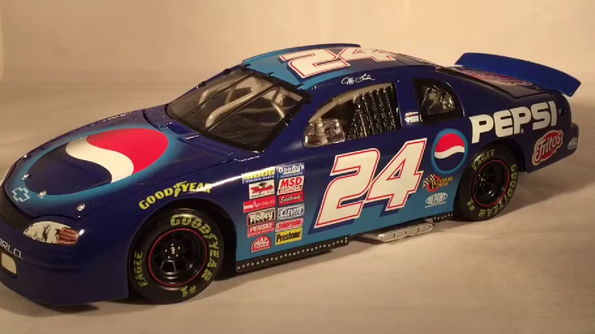 Review: 1999 Jeff Gordon #24 Pepsi Chevy 1/24 NASCAR by BuschWhacker Reviews
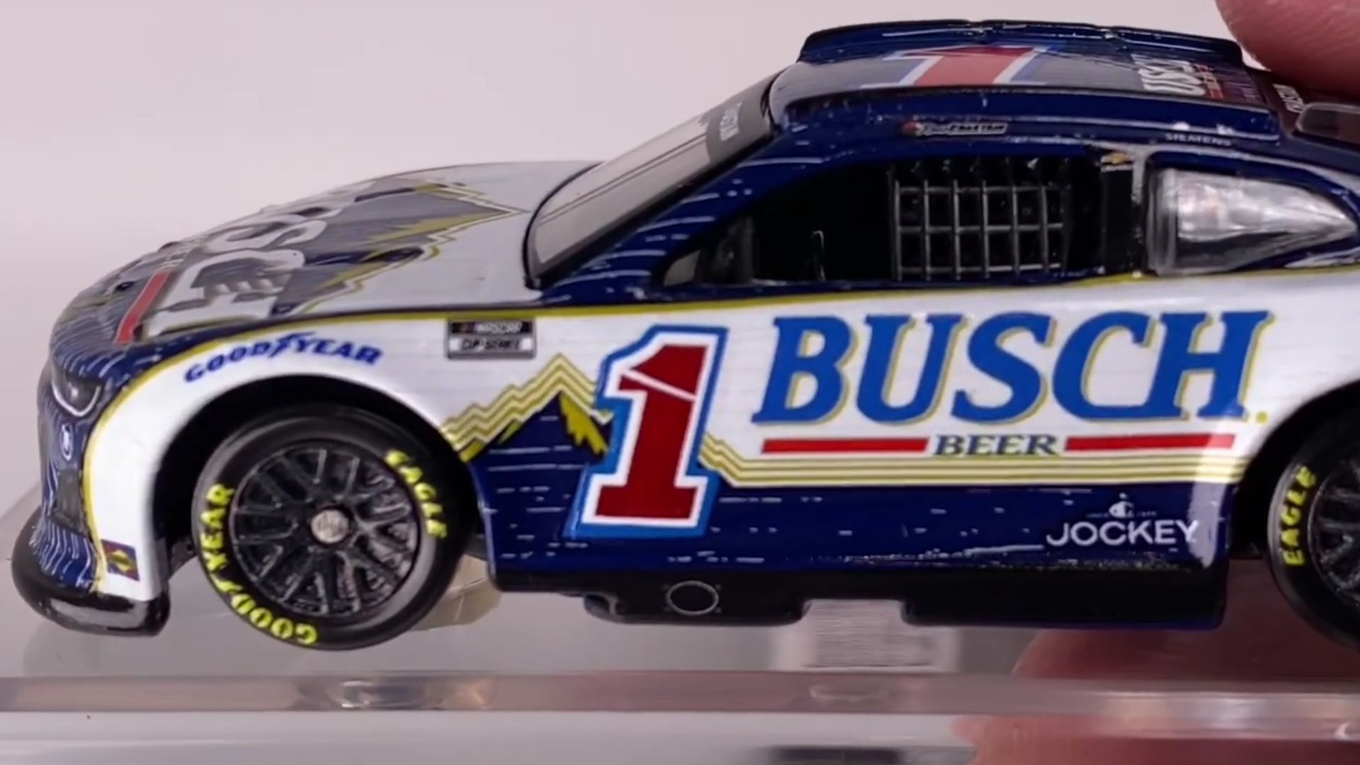
10. 2024 No. 1 "Busch Retro" Chevrolet (Ross Chastain)
Modern throwbacks rarely capture the magic of their predecessors, but Chastain’s Busch Retro scheme did. With vintage typography and a nod to old-school designs, it blended nostalgia with contemporary sharpness. Its fresh approach made it one of the standout designs of the modern NASCAR era.


